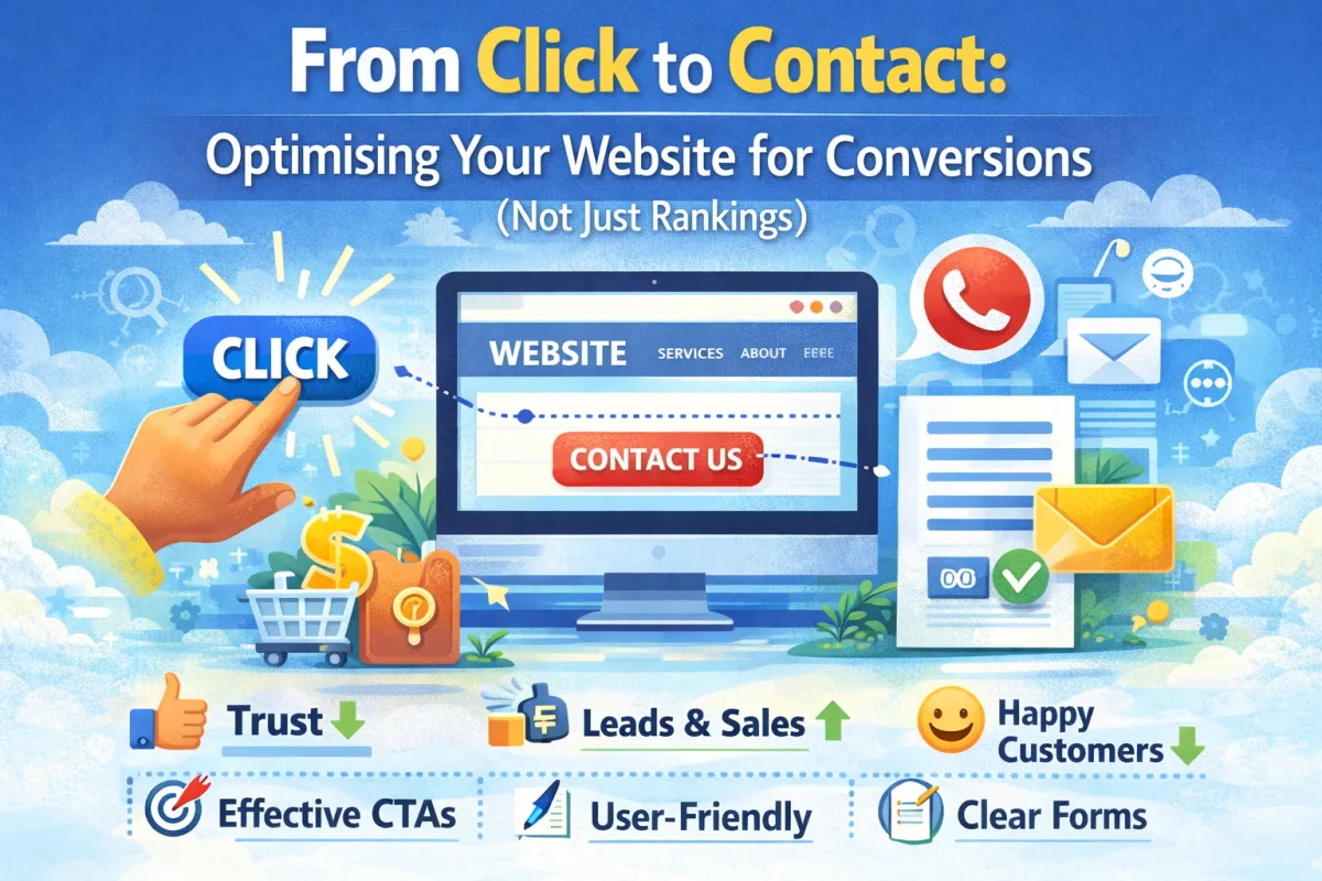
From Click to Contact: Optimising Your Website for Conversions (Not Just Rankings)
Here's something that frustrates a lot of small business owners:
They get their rankings up. Google sends them traffic. Visitors arrive on their website. And then... nothing happens. No enquiries. No phone calls. No contact form submissions.
All that traffic is like water flowing down a drain.
This is actually more common than you'd think. Businesses obsess over rankings and traffic, but they forget about the most important part: getting visitors to actually do something.
You can rank #1 on Google for 100 keywords. But if your website doesn't convert visitors into enquiries, it's pointless.
Conversion optimisation is the difference between a website that gets traffic and a website that gets customers.
In this post, I'm going to show you exactly how to optimise your website so that visitors don't just land on your site—they actually pick up the phone, fill out your form, or book an appointment.
What Even Is a "Conversion"?
Let's start with the basics.
A conversion is any action you want a visitor to take. For most small businesses, that's one of these:
Phone call – Someone calls you directly from your website
Contact form submission – Someone fills out a form with their details
Appointment booking – Someone books a meeting or consultation
Email enquiry – Someone sends you an email
Purchase – Someone buys a product or service (if you sell online)
Signup – Someone signs up for your newsletter or mailing list
The exact conversion depends on your business model. A plumber wants phone calls. A coach might want appointment bookings. A product-based business wants purchases.
But here's what they all have in common: if your website doesn't make it easy for visitors to convert, they'll leave.
Why Do Most Websites Fail to Convert?
Let's be honest: most small business websites are terrible at converting visitors.
Why? Because they're built by someone who cares about making it look pretty, not someone who understands user behaviour and conversion psychology.
Here are the most common reasons websites fail to convert:
1. Unclear Value Proposition Someone lands on your site. They take 3 seconds to read your homepage. And they still don't know what you actually do or why they should care.
Real example: A website headline says "Professional Digital Marketing Solutions." What does that mean? Does it mean SEO? Social media? Ads? A visitor shouldn't have to guess.
Better: "Local SEO for Plumbers in Bristol – Get Found by Customers Searching on Google."
Clear. Specific. The visitor knows exactly what you do in the first 3 seconds.
2. Weak Call-to-Action Your visitor understands what you do. But you haven't made it clear what they should do next.
Maybe your call-to-action button says "Learn More" (vague) instead of "Book Free Consultation" (specific).
Or maybe you have 5 different CTAs on the same page, so the visitor doesn't know which one to click.
3. Missing Trust Signals A visitor lands on your site. They see no reviews. No case studies. No testimonials. No proof that you're legitimate.
They don't know if you're good at what you do. So they leave and try your competitor instead.
4. Poor Mobile Experience Over 60% of searches are now on mobile. But a lot of small business websites look terrible on phones.
Buttons are too small to tap. Text is unreadable. Forms don't work properly. The visitor gets frustrated and leaves.
5. Distracting or Confusing Design Too many colors. Too many fonts. Too many animations. The page feels chaotic.
The visitor doesn't know where to look or what to focus on. They bounce.
6. Long or Complicated Forms You ask for: First name, last name, email, phone, business name, industry, company size, budget, timeline, and a 500-word description of their problem.
The visitor sees that form and thinks, "I'm not filling all that out." They leave.
7. No Urgency There's no reason for the visitor to take action now. They think, "I'll come back later," and they never do.
8. Hidden or Missing Contact Information A visitor wants to call you. But your phone number is nowhere to be found. Or it's buried in tiny text at the bottom of the page.
They give up and call your competitor instead.
The Conversion Optimisation Roadmap
Okay, so you understand the problem. Now let's fix it.
Here's a step-by-step roadmap to optimise your website for conversions.
Step 1: Know Your Ideal Customer and Their Journey
Before you optimize anything, you need to understand who you're trying to convert.
Ask yourself:
Who is your ideal customer?
What problem are they trying to solve?
What are they searching for when they find you?
What concerns do they have? (price, quality, timescales, availability, etc.)
What needs to happen for them to trust you?
What's the final action you want them to take?
Real example: A kitchen fitter's ideal customer is:
Homeowner aged 40-60
Has decided to renovate their kitchen
Searching for "kitchen fitter near me" or "kitchen installation cost"
Concerns: Will it be expensive? How long will it take? Will they do a good job?
Trust need: Case studies and reviews showing previous kitchen installations
Final action: Booking a free site survey
Understanding this shapes everything else.
Step 2: Create a Clear Value Proposition
This is the first thing a visitor sees. It needs to answer: "What do you do? Why should I care?"
Your value proposition should:
Be specific (not generic)
Focus on the benefit, not the feature
Be easy to understand in 3 seconds
Answer the visitor's question: "Can you solve my problem?"
Examples:
Bad: "Professional Web Design Services" Good: "Professional Websites for Trades Businesses (Starting at Just £99)"
Bad: "Digital Marketing Agency" Good: "Local SEO for Dentists – Get More Patient Enquiries From Google"
Bad: "Accounting Solutions" Good: "Accountancy for Small E-Commerce Businesses – Save £1000s in Tax"
Notice the good versions are specific. They tell the visitor exactly what you do and who you do it for. No guessing required.
Step 3: Build Trust Immediately
Trust is everything. Without it, visitors won't convert.
Here's how to build trust on your website:
A. Show Reviews and Ratings
Display your Google rating prominently (if it's 4+ stars)
Show testimonial quotes from real customers
Include customer photos (if available)
Show how many reviews you have ("★★★★★ 47 Reviews")
Real impact: Websites displaying reviews see 34% higher conversion rates.
B. Show Your Face
Include a professional photo of yourself or your team
Write a brief "About" section in first-person
This makes you human and trustworthy
C. Show Your Credibility
Awards or certifications you've won
Years in business
Number of customers served
Press mentions or media coverage
D. Make Contact Info Obvious
Phone number prominently displayed (ideally clickable on mobile)
Email address visible
Physical address (if applicable)
Multiple ways to contact you
E. Display Social Proof
Number of customers
Case studies or project examples
Client logos (if you've worked with recognizable businesses)
Real example: A carpet cleaning company added:
Their Google rating (4.9 stars, 143 reviews)
3 customer testimonials with photos
"Serving Bristol for 12 years"
Their phone number in the header and footer
Photo of the owner on the About page
Conversion rate increased from 2.1% to 4.8% (128% improvement).
Step 4: Create Compelling, Clear Copy
Your website copy should speak to your visitor's problem and show how you solve it.
Structure your copy like this:
Headline: What you do, specifically "Emergency Boiler Repairs in Manchester – Same Day Service"
Subheading: Why it matters "Broken boiler? We'll have you back up and running within 2 hours."
Problem: The visitor's pain point "Your boiler breaks down. It's freezing. You need help now. But regular engineers take days to respond."
Solution: How you solve it "We offer emergency same-day service. Call us, and we're there within 2 hours. Most repairs are fixed on the first visit."
Social proof: Why they should trust you "★★★★★ 94 Reviews – Average response time: 87 minutes"
Call-to-action: What they should do "Call Now: 0161-XXX-XXXX"
Key principle: Write for your customer, not for Google. People read websites. Google reads metadata. If your copy doesn't speak to humans, they won't convert.
Step 5: Optimise Your Call-to-Action (CTA)
Your CTA is the button/link you want visitors to click. It's your single biggest conversion driver.
CTA best practices:
Make it specific:
❌ "Submit" or "Click Here"
✅ "Book Free Consultation" or "Get Free Quote"
Make it visible:
Use contrasting colour (if your site is blue, use an orange button)
Make it big (but not obnoxiously big)
Put it above the fold (visible without scrolling) on mobile
Make it low-friction:
One CTA per section (not 5 different buttons)
For phone calls: make the number clickable on mobile
For forms: use contact forms that load quickly
For appointments: use a booking tool like Calendly
Repeat it:
Put your CTA at the top of the page
Put it in the middle
Put it at the bottom
People don't convert on the first scroll
Real impact: Better CTA buttons increase conversion rates by 20-45%.
Step 6: Simplify Your Forms
If you use contact forms, keep them short. Seriously short.
Real data: Adding one field to a form reduces conversions by ~8%.
Best practice forms ask for:
Name (required)
Email (required)
Phone (required)
Message/Brief description (optional)
That's it. You can ask for more information after they've submitted. But don't barrier with 15 fields upfront.
Real example: A business coach had a form asking for:
First name
Last name
Email
Phone
Business name
Industry
Company size
Monthly budget
Timeline
Type of services interested in (checkbox)
Conversion rate: 0.8%
They simplified to:
Name
Email
Phone
What would you like help with? (text box)
Conversion rate jumped to 3.2%.
Step 7: Use Strategic Urgency (Without Being Pushy)
People procrastinate. You need to give them a reason to take action now instead of "later."
Ways to create urgency:
"Limited appointment slots available this month"
"Book this week and get 20% off"
"Free consultation only available to the first 5 callers"
"Offer ends Friday"
"We're fully booked through March, but I can fit you in if you call today"
Important: Only use real urgency. Making fake urgency damages trust.
Step 8: Remove Friction Points
A friction point is anything that makes converting harder.
Common friction points:
Website is slow (people leave)
Form doesn't work on mobile (people abandon)
You don't show prices (people have to call, and not everyone will)
You don't show availability (people don't know if you can help them)
Chat bot pops up immediately (annoying)
Auto-play video (annoying)
Ads everywhere (distracting)
Go through your website and remove everything that might make a visitor leave.
Step 9: Test and Improve
Conversion optimisation isn't about doing one thing perfectly. It's about constantly testing and improving.
Easy things to test:
CTA button color
CTA button text
Headline variations
Form length
Placement of reviews
Page layout
How to test:
Make one change
Track the conversion rate for 2-4 weeks
If it improves, keep it
If it doesn't, revert and try something else
You don't need fancy A/B testing software. Just track your conversions (phone calls, form submissions, bookings) before and after each change.
Real example: A dental practice tested different headlines:
"Dentist in Brighton" → 1.2% conversion
"Cosmetic Dentistry in Brighton" → 1.8% conversion
"Cosmetic Dentistry in Brighton – Same Day Appointments" → 2.7% conversion
Simple word change. Big impact.
Real-World Case Study: From 0.5% to 3.2% Conversion Rate
Let's look at a complete conversion optimization project.
The Business: Local plumbing company in Essex.
The Problem: They were getting 200 website visitors per month. About 1 enquiry per week (0.5% conversion rate). They wanted to increase enquiries.
What They Changed:
Improved value proposition – Changed homepage from "Professional Plumbing Services" to "Emergency Plumber Essex – Same Day Service, No Call Out Fee"
Added trust signals – Displayed Google rating (4.6 stars, 73 reviews), customer testimonials, and "25 years in business"
Optimised CTA – Changed from vague "Contact Us" button to prominent "Call Now: 0123-XXX-XXXX" in header and "Book Free Survey" button below content
Simplified contact form – Reduced from 12 fields to 4 (name, email, phone, brief description)
Added pricing info – Showed typical cost ranges to set expectations and reduce hesitation
Improved mobile experience – Made site faster, buttons bigger, form easier to complete
Removed friction – Got rid of auto-chat, reduced animations, cleaned up design
Results (8 weeks later):
Conversion rate: 0.5% → 3.2% (540% improvement)
Same 200 visitors, but now 6-7 enquiries per week instead of 1
Cost per enquiry dropped from £40 to £6
They didn't get more traffic. They just converted existing traffic much better.
FAQ
Q: How much does conversion optimisation usually improve results? A: It varies, but most businesses see 20-50% improvement with basic optimisation. The plumbing example above saw 540% improvement, but that's exceptional—they had a lot of low-hanging fruit.
Q: Should I focus on traffic or conversions? A: Both matter, but conversions matter more. A website getting 500 visitors/month with a 5% conversion rate (25 enquiries) beats a website getting 1000 visitors/month with a 1% conversion rate (10 enquiries). Quality beats quantity.
Q: How do I know what my conversion rate is? A: Count your conversions (phone calls, form submissions, bookings) for a month. Divide by total website visitors. Formula: (Conversions ÷ Visitors) × 100 = Conversion Rate %. If you're not tracking visitors, set up Google Analytics. It's free.
Q: What's a good conversion rate? A: It varies by industry. Most service-based businesses see 1-3%. E-commerce is typically 2-5%. If you're below 1%, there's definitely room for improvement.
Q: Should I show pricing on my website? A: Usually yes. Hiding pricing makes people hesitant. They assume you're expensive. At minimum, show a price range or "starting at £X."
Q: How long does conversion optimisation take to see results? A: You can see results within 1-2 weeks for obvious changes (better CTA, simplifying form). For more subtle improvements, 2-4 weeks.
Q: Should I use a chat bot on my website? A: Only if you're going to respond quickly (within 2 minutes). Otherwise, it's just annoying. A well-placed phone number and contact form are usually better.
Q: What's more important—phone calls or form submissions? A: Phone calls usually convert better (higher-intent), but not everyone will call. Offer both. Let people choose their preferred contact method.
Q: How do I get more Google reviews to show on my website? A: Ask happy customers directly. "We'd love a Google review—it helps us reach more customers like you." Make it easy by providing a direct link to your Google review page.
Q: Should I have a popup on my website? A: Popups can work, but they're annoying if not done right. If you use one: don't show it immediately, make it easy to close, and only show it once per visitor per week.
Q: What if my conversion rate is already good (like 5%+)? A: Nice! But you can probably still improve. Even good websites can get 10-20% better with optimisation. The top 1% of websites are constantly testing and improving.
Q: Does page speed affect conversions? A: Absolutely. A slow site kills conversions. Every 1 second of delay reduces conversions by 7%. Make sure your site loads in under 3 seconds.
The Bottom Line
Getting traffic to your website is only half the battle. The other half is converting that traffic into customers.
Most small businesses get this wrong. They obsess over rankings and traffic. Meanwhile, their website converts at 0.5% because it's confusing, slow, and doesn't clearly tell visitors what to do.
You don't need magical tactics. You need to:
Make your value proposition clear
Build trust with reviews and social proof
Have a clear call-to-action
Remove friction
Test and improve
That's it. These fundamentals work for every business.
If you're getting traffic but not enquiries, your website's conversion rate is the problem—not your rankings.
Want a conversion audit? We can review your website, identify why visitors aren't converting, and give you a specific roadmap to improve.
We'll look at your current conversion rate, identify the biggest friction points, and tell you exactly what to fix first. Most of our clients see improvement within 2-4 weeks.
No guesswork. Just clear, actionable advice based on what actually works.
You can also get in touch directly if you'd prefer email or phone.